Hi friends, honest opinion please on this potential cover…I really like it – but want to get other people’s eyes on it…
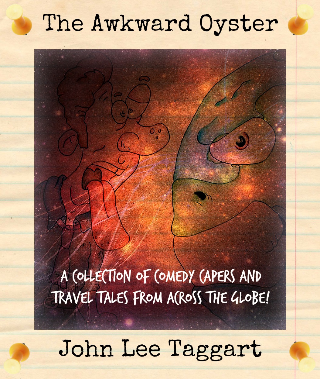
Little background on this ~ my Grandma used to always say “the world’s your oyster!”, and would perpetually be so enthusiastic about my trips, and well…just about everything I ever did. So this is a little homage in a way. Sadly she lost her fight with cancer – but the Macmillan nurses (to which the proceeds of the book will go to) were always an amazing help.
I’m still trying to format the thing! It’s coming soon…

45 responses to “The Awkward Oyster”
Great name!
LikeLiked by 1 person
Thanks! I think I’ve finally settled on that title 🙂
LikeLiked by 2 people
Nice sounds interesting! 🙂
LikeLiked by 1 person
Love the cover and the title! The only thing I would say is that the title and author font might be better as a straightforward font and not the same as the blurb, if that makes sense.
LikeLiked by 1 person
It’s definitely memorable and you can’t go wrong with that!
LikeLiked by 1 person
Cheers Jess 🙂
LikeLike
I think it’s terrific!
LikeLiked by 1 person
Thank you very much 🙂
LikeLiked by 1 person
I think it could work, although personally I don’t know if it gives off the impression I usually put with your stories.
LikeLiked by 1 person
That’s the difficult thing really 😦
LikeLike
True, but I’m sure you’ll do fine with it:) Good luck!!
LikeLike
What a great title and cover! I agree with what First Night Design said about the font. If I came across this book online or at a book store I would definitely pick it up for further inspection.
LikeLiked by 2 people
Cheers Ray! That means a lot 🙂 Made those alterations suggested – have to say it does look a lot better!
LikeLiked by 1 person
I think the new title and author font could be a little thinner.
LikeLiked by 1 person
Got it!!!! I’ll edit soon 🙂
LikeLiked by 1 person
I like it a lot. It somehow captures a childlike view but also conveys something a bit sinister.
LikeLiked by 1 person
RIght on the money Marissa, as per 😀
LikeLiked by 1 person
I like it! Love the illustration, and the title is very clever too. Grandmas always give good advice 🙂
LikeLiked by 1 person
The best 🙂 thanks Edwina, probably my fave so far anyway.
LikeLiked by 1 person
Why “angry”? Why not “funny” or “odd”? I really like the drawing though. That’s pretty cool.
LikeLiked by 1 person
Thank you! Well, angry oyster has a ring to it! And always at the time, I think the situations are hostile, crazy, or anything else…but it is often when I look back that I can see the positives, and the humour. I didn’t think of it too much to be honest, but that’s probably the reason haha…do you think it works, or no?
LikeLiked by 1 person
Here’s the thing. It makes a lot of sense when you explain it, but unfortunately, not everyone is going to wait to hear the explanation. I wonder if a different adjective (irate or irritated) or a way to break up the stark emotion of this one would help.
Then again, I look into things too much. I was going off my first reaction, but mine is probably unique. It;s a good title. I may just stick to it.
LikeLike
Nahh I’m open to changes for sure! And it makes a lot of sense…new title coming soon 😉
LikeLike
If the oyster is angry does it still taste good? I like the name!
LikeLike
It tastes great, hahaha 😉
LikeLike
Hi John. What concerns me about the drawing is the coloring. It’s a little dark and hard to see? In my opinion, it would probably be better to have the picture lighter/more colorful so people can more easily see what’s going on. Also is the whole book going to have illustrations? If I didn’t know anything about it, my first impression would probably be that it’s a children’s book from the title and cover. Sounds like you are some kind of heroine going to vanquish an evil oyster. Just my two cents. Also, if your book is going to be available in the US I’d love to buy it 🙂
LikeLike
You’re right it is pretty dark now that I look at it! I wanted to have illustrations throughout, but then I was advised that it would just make it more expensive for the buyer in the long run – which would then mean the final cost would be high. A shame really.
It does look quite childish I think, but I don’t like my face much so I preferred this to like a huge picture of myself on the cover. I don’t know, haha 😦
LikeLike
ah! and I originally meant to reply to this: “but I don’t like my face much so I preferred this to like a huge picture of myself on the cover”…. I like your face!
and you’ll have to have a small thumbnail on the back at least, so there’s that 😛
LikeLike
Thank you 🙂 that’s kind of you to say! By the way ‘Awkward Oyster’ may be better than ‘Angry Oyster’ right? Hmmm…sorry just in the middle of it now!
LikeLiked by 1 person
Awkward is not bad… keeps the alliteration of the aw, oy sounds…
LikeLike
Awwww that’s too bad.
And as long as you’re happy with it, it’s fine. I wouldn’t advise putting a large picture of yourself on the cover either haha. (Not that I don’t like your face, just seems kinda pompous to have the writer’s face all over the cover). Just wanted to give my honest first impression of the cover, and you can do what you want with it! So far, it seems like a lot of people really like it, but I figured it was better to give my honest opinion than not say anything.
LikeLike
I think the darkness works. It will be lighter in the actual publication. Also, I’d say it looks more cartoon-y than childish, plus the subtitle gives the reader a good enough idea that this is not about a crime-fighting, oyster buster.(though, grammar note: no comma after “capers.”
The drawing takes the edge off the word “angry: too, so I think that works out.
LikeLike
Haha! The Angry Oyster! I love it! 😀
LikeLiked by 1 person
I’m happy to hear that!!
LikeLike
It’s funny as all getout, 😀
LikeLike
Catchy Title, cool cover. Nicely done.
LikeLiked by 1 person
Thank you Paula 🙂
LikeLike
We have a local restaurant called the Ugly Oyster. I like “Angry” better. But, seriously, what does it really mean to say the world is “your oyster” ?…personally, I never wanted one. Except maybe grilled, and in garlic butter.
LikeLike
Oooh garlic butter sounds good…I really don’t get the expression either, haha!
LikeLiked by 1 person
I like it! Did you draw it?
LikeLiked by 1 person
I did indeed 🙂
LikeLiked by 2 people
Very sorry about your grandmother John. I think the poster is wonderful, but couldn’t you have come up with a more original name other than John Lee Taggart. :o)
LikeLiked by 1 person
Is that a caricature of you? Is that supposed to be an oyster? (It looks more like a fish.) As regards the cover, unlike my sister, I’m lousy when it comes to interpreting art and poetry. But the cover has wide appeal, and is thankfully G+. 🙂
LikeLiked by 1 person
hahahaha! Okay to answer the questions, yes it’s supposed to be me – errr it’s the earth – oyster is just a metaphor I guess, and errrrr…yeah that’s it!
LikeLike
Wow! A published book!! That is brilliant…do it! The cover looks cool, but a little dark in color, so it’s hard to see the drawn characters. Otherwise, this is just too cool!
LikeLiked by 1 person